A tribute to the humble “leave form” – Part 3
[Note: It appears that SharePoint magazine has bitten the dust and with it went my old series on the “tribute to the humble leave form”. I am still getting requests to a) finish it and b) republish it. So I am reposting it to here on cleverworkarounds. If you have not seen this before, bear in mind it was first published in 2008.]
Hi and welcome to part 3 of a series of article that are dedicated to raising awareness of the plight of the much-misused leave form. Long has it been the favourite “real world” example of consultants and IT departments worldwide, to demonstrate how SharePoint product features can be used to achieve a utopian dream of reliable, consistent and optimised processes.
The leave form is a phenomena that is enigmatic. It’s simplicity and suitability to demonstrate the concepts of SharePoint cannot be denied. But at the same time, you need to be very careful since it can set expectations that can be difficult to meet when it comes to other business processes that are more complex and representative of more critical business function. In this series I am neither promoting nor dumping on the suitability of the leave form as a real-world example. Instead, I hope that the reader will be in a better position to make up their own mind as we progress through the series and it slowly gets tougher.
To that end, at the end of part 2, we were left with an incomplete InfoPath form for the Springfield nuclear power plant. This form was created by importing an MSWord version of the original form, along with a little graphical manipulation. So let’s pick up from where we left off …
The objective is part 3 is to get the form functional and into a form ready to be published to SharePoint.
InfoPath Next Steps – Adding Controls
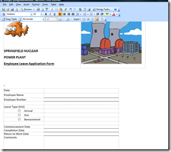
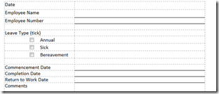
Okay so here is where we are at (click to see the large version of the form above). We have finished the graphics in the header of the form, and now we need to turn our attention to where the action happens. InfoPath attempts to automatically create form textboxes, checkboxes and buttons based on what is has gleaned from any MSWord or Excel based form that you have imported. In my Springfield Nuclear Plant form, during the import, it created checkboxes for us for the leave types, but did not create textboxes for the other fields that we require. What you will notice however, is that InfoPath created a table to hold this information as shown below.
So we need to now create those fields (called “Controls”) to allow the user to fill in the form.
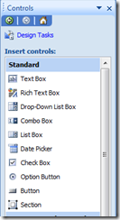
In the “Design Tasks” pane, click the “Controls” link, and you will be presented with the interface to add controls to the form (see the screengrab above). I am not going to explain the functionality of each InfoPath control in this article, but what I will say is that we will use three of controls from those available. The “Text Box”, the “Option Button” and the “Date Picker”.
TextBox Controls
First up, let’s deal with the “Employee Name” field. We will make this a text box so that an employee can enter their name.
Click on the “Text Box” control in the “Design Tasks” pane and drag it across to the blank cell next to the text “Employee Name”.
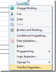
The result will be a fairly nondescript text box in that cell. InfoPath has named this cell “field4″, and if you try this yourself, you will receive a similar name.
Why is this control called “field4″? It is because the original import from MSWord created three checkboxes for the Leave type. Therefore they were named, “field1″, “field2″, and “field3″, respectively.
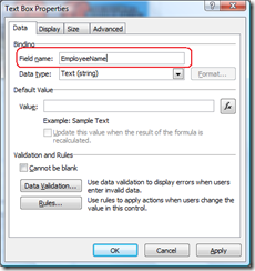
Now field4 is not a good name for a text box. So we will change its name to something that makes sense. (Why we do this will become apparent in future posts). Right click on the newly created text box and choose “Properties”. In the next dialog box, change the field name from “field4″ to “EmployeeName”.
While we have this dialog box open, it is worth examining some of the other options available here. We can
- Set a default value for the text box
- Set some validation properties. For example, ticking the “cannot be blank” box means that the form cannot be completed unless this textbox has been filled in. When you think about it, it doesn’t make a hell of a lot of sense to have a leave form without the employee name being mandatory (and therefore not blank).
- Set some rules. Rules allow actions to be taken *after* data has been entered into the form. (We will be utilising rules very soon, and will examine this in more detail then)
We have some additional text boxes to create as well. The “Employee Number” and “Comments” fields will also require text box controls to be added to the form.
The steps are identical to what we just performed for the “Employee Name” field. Drag them to the form, and rename them via the properties menu.
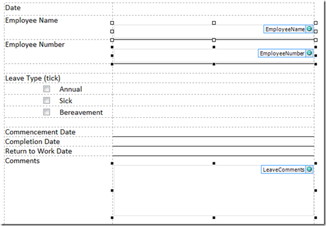
Once the textbox controls have been added to the forms and renamed, the form now looks like screenshot below. (The “LeaveComments” textbox is a single line by default and has been resized)
Date Picker Control
Usually by this time in a demonstration situation, clients are starting to get interested, as they can see where we are going with this. Have a guess what the “Date Picker” control does? By jove, it picks dates! Who would have thought?
Click on the “Date Picker” control in the “Design Tasks” pane and drag it across to the blank cell next to the text “Commencement Date”.
Do the same for “Completion Date” and “Return to Work Date”.
As per the textboxes, rename the controls to match the data being entered. So for the Commencement Date field, rather than “field6″, make it “CommencementDate”.
Below shows the result of performing this task on all three date fields.
Option Button Control
With the option boxes for the type of leave being requested, we have a little more work to do. When InfoPath imported the MSWord document, it decided to use checkboxes for the leave type. As it happens, this is not the behaviour that we want because checkboxes allow multiple selections.
Instead we want only one option to be selected. So we will delete the controls created by the import, and add back “option button” controls in their place.
Clicking on each checkbox on the form, we can delete the existing ones with a tap of the delete key.
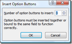
Now click on the “Option Button” control in the “Design Tasks” pane and drag it across to the the left of the word “Annual”. Unlike the other two controls that we have used, this time we need to supply more information before it gets added to the form. We have three types of leave on this form, and as it happens, InfoPath defaults to three option buttons.
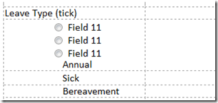
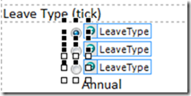
Click OK, and you will see the screen is now slightly messy. We have our three option buttons, but they are all in the one cell, and are all labelled the same (Field11 in my example).
Why are they labelled the same you may ask? The reason is that although there are three option buttons, they are all linked as a single field. So if I right click on any one of the three option buttons and rename it via the properties dialog box, all three option buttons are renamed! If you are wondering why this is, consider that the whole point of using option buttons is because you can only select one option. If you can only select one option, then you only have one value to store.
Right click on the first option button and I will show you what I mean.
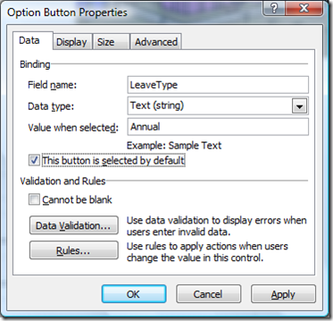
Below I have renamed the first option button to “LeaveType”. Look closely and you will see a “Value When Selected” text box.
I have changed the value to “Annual”, to represent annual leave being selected. I have also set it as the default value for the checkbox as most of the time leave is annual (vacation leave).
After cllicking OK, you will see that the other two controls are also now named “LeaveType”.
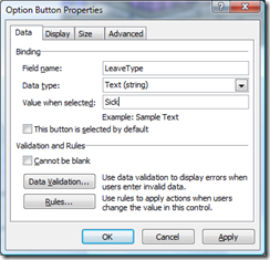
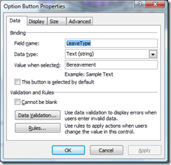
Now right click on the second option button and examine its properties. You will see that it is named LeaveType. I have changed the “Value when selected” field to “Sick”, to represent sick leave. For the third option button I have labelled it “Bereavement”
The final thing to do is now to move the last two option buttons into the proper cells and tidy it up. This is a straightforward drag and drop operation. While here I have also moved a few of the other cells around and resized them. At any time you can preview your work by clicking the “Preview” button on the InfoPath toolbar.
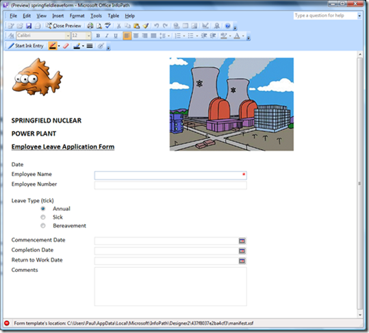
At this point, a preview looks like this:
Looks nice enough to me (but hey I’m not hired for my design skills!). Note that the Employee Name field is marked with a red asterisk, meaning that it must be filled in. Additionally the date fields now have buttons allowing you to easily pick a day from a calendar view.
Are we done yet? I wanna get to SharePoint…
So here we are with a semi-functional InfoPath form. At this point we haven’t really used SharePoint at all! So in the next article I will cover publishing the form in its current state into SharePoint and viewing the form within a browser.
We still have some significant work to do however, since we haven’t covered all many of the requirements yet. For example, we still haven’t covered data validation in the form. Additionally, we do not yet have a field on the form showing the number of days absent (incorporating the calculation of weekends). The form doesn’t automatically fill in your name when the form is loaded either. Finally, we will also want to add a SUMBIT and CANCEL button to the form.
Until then, thanks for reading
Paul Culmsee


Leave a Reply