Why can’t users find stuff on the intranet? An IBIS synthesis–Part 3
Hi all
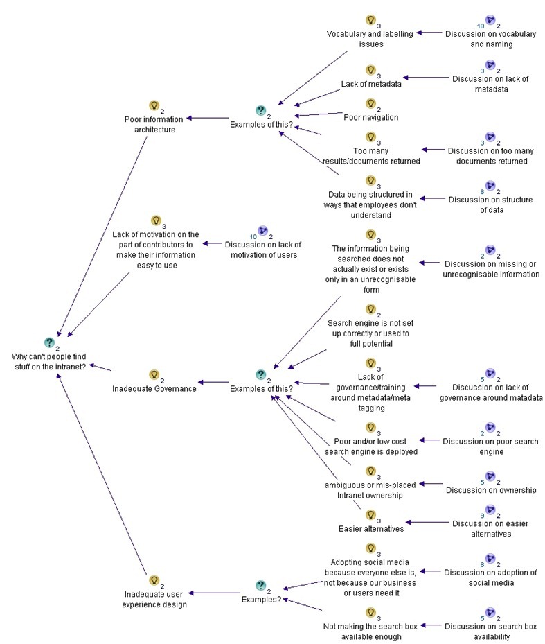
This is the third post in a quick series that attempts to use IBIS to analyse an online discussion. The map is getting big now, but luckily, we are halfway through the discussion and will have most of the rationale captured by the end of this post. We finished the part 2 with a summary map that has grouped the identified reasons why it is hard to find information on intranets into core themes. Right now there are 4 themes that have emerged. In this post we see if there are any more to emerge and fully flesh out the existing ones. Below is our starting point for part 3.
Our next two responses garnered more nodes in the map than most others. I think this is a testament to the quality of their input to the discussion. First up Dan…
Dan Benatan • Having researched this issue across many diffferent company and departmental intranets, my most frequent findings are:
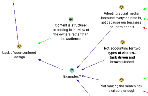
1. A complete lack of user-centred design. Content that many members of the organization need to access is structured according to the view of the content owners rather than the audience. This should come as no surprise, it remains the biggest challenge in public websites.
2. A failure to offer an entry level view. Much of the content held on departmental intranets is at a level of operational detail that is meaningless to those outside the team. The information required is there, but it is buried so deep in the documents that people outside the team can’t find it.
3. The intranet’s lazy over-reliance on search. Although many of us have become accustomed to using Google as our primary entry point to find content across the web, we may do this because we know we have no hope of finding the content through traditional navigation. The web is simply far too vast. We do not, however, rely purely on search once we are in the website we’ve chosen. We expect to be able to navigate to the desired content. Navigation offers context and enables us to build an understanding of the knowledge area as we approach the destination. In my research I found that most employees (>70%) try navigation first because they feel they understand the company well enough to know where to look.
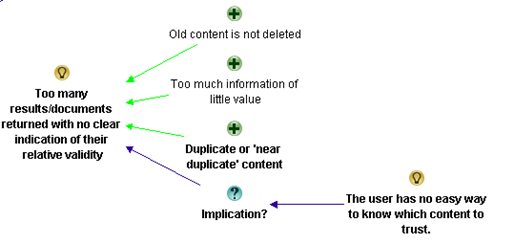
4. Here I agree with many of the comments posted above. Once the user does try search, it still fails. The search engine returns too many results with no clear indication of their relative validity. There is a wealth of duplicate content on most intranets and , even worse, there is a wealth of ‘near duplicate’ content; some of which is accurate and up-to-date and much that is neither. The user has no easy way to know which content to trust. This is where good intranet management and good metadata can help.
My initial impression was that this was an excellent reply and Dan’s experience shone through it. I thought this was one of the best contributions to the discussion thus far. Let’s see what I added shall we?
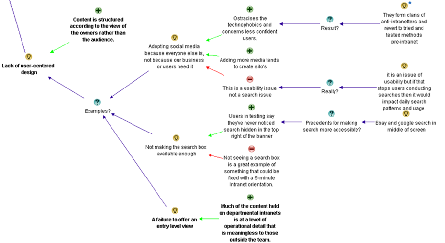
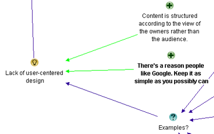
First up, Dan returned to the user experience issue, which was one of the themes that had emerged. I liked his wording of the issue, so I also changed the theme node of “Inadequate user experience design” to Dan’s framing of “Lack of user-centred design”, which I thought was better put. I then added his point about content structured to the world view of owner, rather than audience. His second point about an “entry level view” relates to the first point in the sense that both are user centred design issues. So I added the entry level view point as an example…
I added Dan’s point about the intranet’s lazy over-reliance on search to the information architecture theme. I did this because he was discussing the relationship between navigation and search, and navigation had already come up as an information architecture issue.
Dan’s final point about too many results returned was already covered previously, but he added a lot of valuable arguments around it. I restructured that section of the map somewhat and incorporated his input.
Next we have Rob, who also made a great contribution (although not as concise as Dan)
Rob Faulkner • Wow… a lot of input, and a lot of good ideas. In my experience there can be major liabilities with all of these more “global” concepts, however.
No secret… Meta data is key for both getting your site found to begin with, as well as aiding in on-site search. The weak link in this is the “people aspect” of the exercise, as has been alluded to. I’ve worked on interactive vehicles with ungodly numbers of pages and documents that rely on meta data for visibility and / or “findability” (yes, I did pay attention in English class once in a while… forgive me), and the problem — more often than not — stems from content managers either being lazy and doing a half ass job of tagging, if at all, or inconsistency of how things are tagged by those that are gung-ho about it. And, as an interactive property gets bigger, so too does the complexity tagging required to make it all work. Which circles back to freaking out providers into being lazy on the one hand, or making it difficult for anyone to get it “right” on the other. Vicious circle. Figure that one out and you win… from my perspective.
Another major issue that was also alluded to is organization. For an enterprise-class site, thorough taxonomy / IA exercises must be hammered out by site strategists and THEN tested for relevance to target audiences. And I don’t mean asking targets what THEY want… because 9 times out of 10 you’re either going to get hair-brained ideas at best, or blank stares at worst. You’ve just got to look at the competitive landscape to figure out where the bar has been set, what your targets are doing with your product (practical application, OEMing, vertical-specific use, etc… then Test the result of your “informed” taxonomy and IA to ensure that it does, in fact, resonate with your targets once you’ve gotten a handle on it.
Stemming from the above, and again alluded to, be cautious about how content is organized in order to reflect how your targets see it, not how internal departments handle it. Most of the time they are not one in the same. Further, you’ve got to assume that you’re going to have at least two types of visitors… task-driven and browse-based. Strict organization by product or service type may be in order for someone that knows what they’re looking for, but may not mean squat to those that don’t. Hence, a second axis of navigation that organizes your solutions / products by industry, pain point, what keeps you up at night, or whatever… will enable those that are browsing, or researching, a back door into the same ultimate content. Having a slick dynamic back-end sure helps pull this off
Finally, I think a big mistake made across all verticals is what the content consists of to begin with. What you may think is the holy grail, and the most important data or interactive gadget in the world may not mean a hill-of-beans to the user. I’ve conducted enough focus groups, worldwide, to know that this is all typically out of alignment. I never cease to be amazed at exactly what it is that most influences decision makers.
I know a lot of this was touched upon by many of you. Sorry about that… damn thread is just getting too long to go back and figure out exactly who said what!
Cheers…
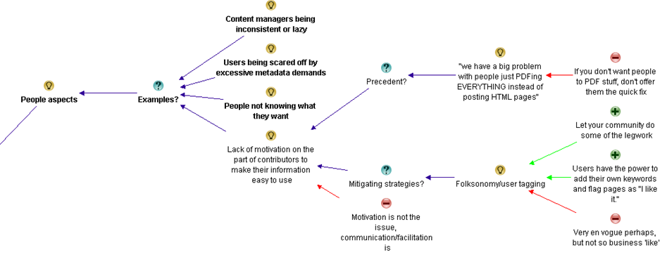
Now Rob was the first to explicitly mention “People aspects”, and I immediately realised this was the real theme that “Lack of motivation on the part of contributors…”was getting at. So I restructured the map so that “people aspects” was the key theme and the previous point of “Lack of motivation” was an example. I then added Rob’s other examples.
After making his points around people aspects, Rob then covers some areas well covered already (metadata, content organsiation), so I did not add any more nodes. But at the end, he added a point about browse oriented vs. search oriented users, which I did add to the user-centred design discussion.
Rob also made a point about users who know what they want when searching for information vs. those who do not. (In Information Architecture terms, this is called “Known item seeking” vs “exploratory seeking”). That had not been covered previously, so I added it to the Information Architecture discussion.
Finally, I captured Rob’s point about the wrong content being managed in the first place. This is a governance issue since the best Information architecture or user experience design won;t matter a hoot if you’re not making the right content available in the first place.
Hans Leijström • Great posts! I would also like to add lack of quality measurements (e.g. number of likes, useful or not) and the fact that the intranets of today are not social at all…
Caleb Lamz • I think everyone has provided some great reasons for users not being able to find what they are looking for. I lean toward one of the reasons Bob mentions above – many intranets are simply not actively managed, or the department managing it is not equipped to do so.
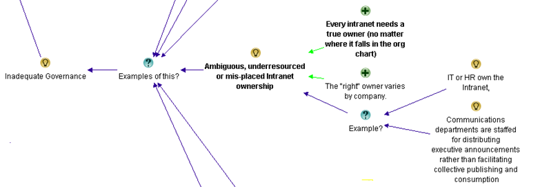
Every intranet needs a true owner (no matter where it falls in the org chart) that acts a champion of the user. Call it the intranet manager, information architect, collaboration manager, or whatever you want, but their main job needs to be make life easier for users. Responsibilities include doing many of the things mentioned above like refining search, tweaking navigation, setting up a metadata structure, developing social tools (with a purpose), conducting usability tests, etc.
Unfortunately, with the proliferation of platforms like SharePoint, many IT departments roll out a system with no true ownership, so you end up with content chaos.
There is no need to add anything from Hans as he was re-iterating a previous comment about analytics which was captured already. Caleb makes a good point about ownership of content/intranet which is a governance issue in my book. So I added his contribution there…
Dena Gazin • @Suzanne. Yes, yes, yes – a big problem is old content. Spinning up new sites (SharePoint) and not using, or migrating sites and not deleting old or duplicative content. Huge problem! I’m surprised more people didn’t mention this. Here’s my three:
1. Metadata woes (@Erin – lack of robust metadata does sound better as improvements can be remedied on multiple levels)
2. Old or duplicate content (Data or SharePoint Governance)
3. Poorly configured search engine
Bonus reason: Overly complicated UIs. There’s a reason people like Google. Why do folks keep trying to mess up a good thing? Keep it as simple as you possibly can. Create views for those who need more. 80/20 rule!
Dena’s points are a reiteration of previous points, but I did like her “there is a reason people like google” point, which I considered to be a nice supporting argument of the entire user-centric design theme.
Next up we have another group of discussions. What is interesting here is that there is some disagreement – and a lot of prose – but not a lot of information was added to the map from it.
Luc de Ruijter • @Rob. Getting information and metastructures in place requires interactions with the owners of information. I doubt whether they are lazy or blank staring people – I have different experiences with engaging users in preparing digital working environments. People may stare back at you when you offer complete solutions they can say “yea” or “nay” to. And this is still common practice amogst Communication specialists (who like creating stuff themselves first and then communicate about them to others later). And if colleagues stare blank at your proposal, they obviously are resisting change and in need of some compelling communciation campaign…
Communication media legacy models are a root cause for failing intranets.
Tagging is indeed a complex excercise. And we come from a media-age in which fun predominated and we were all journalists and happy bunnies writing post after post, page after page, untill the whole cluttered intranet environment was ready again for a redesign.
Enterprise content is not media content, but enterprise content. Think about it (again please 🙂 ). If you integrate the storage process of enterprise content into the “saving as” routine, you’ll have no problems anymore with keeping your content clean and consistent. All wil be channeled through consistent routines. This doesn’t kill adding free personal meta though, it just puts the content in a enterprise structure. Think enterprise instead of media and tagging solutions are for grabs.
I agree that working on taxonomies can become a drag. Leadership and vison can speed up the process. And mandate of course.
I believe that the whole target rationale behind websites is part of the Communication media legacy we need to loose in order to move forward in better communication services to eployees. Target-thinking hampers the construction of effectve user centered websites, for it focusses on targets, persona, audiences, scenario’s and the whole extra paper media works.
While users only need flexibility, content in context, filters and sorting options. Filtering and sorting are much more effective than adding one navigation tree ater another. And they require a 180° turn in conventional communciation thinking.
@Caleb. Who manages an intranet?
Is that a dedicated team of intranet managers, previously known as content managers, previously known as communciation advisors, previously known as mere journalists? Or is intranet a community affair in which the community IS the manager of content? Surely you want a metamodel to be managed by a specialist. And make general management as much a non-silo activity as possible. Collaboration isn’t confined to silo’s so intranet shouldn’t be either.
A lot of intranets are run by a small group of ‘experts’ whose basic reasoning is that intranet is a medium like an employee magazine. If you want content management issues, start making such groups responsible for intranet.
In my experience intranets work once you integrate them in primary processes. Itranet works for you if you make intranet part of your work. De-medialise the intranet and you have more chance for sustainable success.
Rolling out Sharepoints is a bit like rolling back time. We’ll end up somewhere where we already were in 2001, when digital IC was IT policy. The fact that we are turning back to that situation is a good and worrying illustration of the fact that strategy on digital communications is lacking in the Communications department – otherwise they wouldn’t loose out to IT.
@Dena. I think your bonus reason is a specific Sharepoint reason. Buy Sharepoint and get a big bonus bag of bad design stuff with it – for free! An offer you can’t refuse 🙂
Luc de Ruijter • @Dena. My last weeks tweet about search: Finding #intranet content doesn’t start with #search #SEO. It starts with putting information in a content #structure which is #searchable. Instead of configuring your search engine, think about configuring your content first.
Once again Luc is playing the devils advocate role with some broader musings. I might have been able to add some of this to the map, but it was mostly going over old ground or musings that were not directly related to the question being asked. This time around, Rob takes issue with some of his points and Caleb agrees…
Rob Faulkner • @Luc, Thanks for your thoughtful response, but I have to respectfully disagree with you on a few points. While my delivery may have been a bit casual, the substance of my post is based on experience.
First of all, my characterizations of users being 1) lazy or 2) blank staring we’re not related to the same topic. Lazy: in reference to tagging content. Blank Staring: related to looking to end users for organizational direction.
Lazy, while not the most diplomatic means of description, I maintain, does occur. I’ve experienced it, first hand. A client I’m thinking of is a major technology, Fortune 100 player with well over 100K tech-focused, internet savvy (for the most part) employees. And while they are great people and dedicated to their respective vocation, they don’t always tag documents and / or content-chunks correctly. It happens. And, it IS why a lot of content isn’t being located by targets — internally or externally. This is especially the case when knowledge or content management grows in complexity as result of content being repurposed for delivery via different vehicles. It’s not as simple as a “save as” fix. This is why I find many large sites that provide for search via pre-packed variables, — i.e. drop-downs, check-boxes, radio-buttons, etc — somewhat suspect, because if you elect to also engage in keyword index search you will, many times, come up with a different set of results. In other words, garbage in, garbage out. That being said, you asked “why,” not “what to do about it” and they are two completely different topics. I maintain that this IS definitely a potential “why.”
As far as my “blank stare” remark, it had nothing to do with the above, which you tied it to… but I am more than fluent in engaging and empowering content owners in the how’s and why’s of content tagging without confusing them or eliciting blank stares. While the client mentioned above is bleeding-edge, I also have vast experience with less tech-sophisticated entities — i.e. 13th-century country house hotels — and, hence, understand the need to communicate with contributors appropriate to what will resonate with them. This is Marketing 101.
In regard to the real aim of my “blank stare” comment, it is very germane to the content organization conversation in that it WILL be one of your results if you endeavour to ask end-users for direction. It is, after all, what we as experts should be bringing to the table… albeit being qualified by user sounding boards.
Regarding my thoughts on taxonomy exercises… I don’t believe I suggested it was a drag, at all. The fact is, I find this component of interactive strategy very engaging… and a means to create a defensible, differentiated marketing advantage if handled with any degree of innovation.
In any event, I could go on and on about this post and some of the assumptions, or misinterpretations, you’ve made, but why bother? When I saw your post initially, it occurred to me you were looking for input and perhaps insight into what could be causing a problem you’re encountering… hence the “why does this happen” tone. Upon reviewing the thread again, it appears you’re far more interested in establishing a platform to pontificate. If you want to open a discussion forum you may want to couch your topic in more of a “what are your thoughts about x, y, z?”… rather than “what could be causing x, y, z?” As professionals, if we know the causes we’re on track to address the problem.Caleb Lamz • I agree with Rob, that this thread has gone from “looking for input” to “a platform to pontificate”. You’re better off making this a blog post rather than asking for input and then making long and sometimes off the cuff remarks on what everyone else has graciously shared. It’s unproductive to everyone when you jump to conclusions based on the little information that other users can provide in a forum post.
Luc de Ruijter • The list:
Adopting social media from a hype-driven motivation (lack of coherence)
big problem with people just PDFing EVERYTHING instead of posting HTML pages
Comms teams don’t listen and learn from all levels of the business
Content is not where someone thought it would be or should be or its not called what they thought it was called or should be called.
content is titled poorly
content managers either being lazy and doing a half ass job of tagging
content they are trying to find is out of date, cannot be trusted or isn’t even available on the intranet.
Documents have no naming convention
failure to offer an entry level view
inconsistency of how things are tagged
Inconsistent vocabulary and acronyms
info is organised by departmental function rather than focussed on end to end business process.
information being searched does not actually exist or exists only in an unrecognisable form and therefore cannot be found!
intranet’s lazy over-reliance on search
intranets are simply not actively managed, or the department managing it is not equipped to do so.
intranets of today are not social at all
just too much stuff
Lack of content governance, meta-data and inconsistent taxonomy, resulting in poor search capability.
Lack of measuring and feedback on (quality, performance of) the intranet
Lack of metadata
lack of motivation on the part of contributors to make their information easy to use
lack of quality measurements (e.g. number of likes, useful or not
lack of robust metadata
lack of robust metadata, resulting in poor search results;
lack of user-centred design
main navigation is poor
not fitting the fact that there are at least two types of visitors… task-driven and browse-based
Not making the search box available enough
Old content is not deleted and therefore too many results/documents returned
Old or duplicate content (Data or SharePoint Governance)
Overly complicated UIs
Poor navigation, information architecture and content sign-posting
Poorly configured search engine
proliferation of platforms like SharePoint
relevance of content (what’s hot for one is not for another)
Search can’t find it due to poor meta data
Search engine is not set up correctly
search engine returns too many results with no clear indication of their relative validity
structure is not tailored to the way the user thinksLuc de Ruijter • This discussion has produced a qualitative and limited list of root causes for not finding stuff. I think we can all work with this.
@Rob & @Caleb My following question is always what to do after digesting and analysing information. I’m after solutions, that;s why I asked about root causes (and not symptoms). Reading all the comments triggers me in sharing some points of view. Sometimes that’s good to fuel the conversation sometimes. For if there is only agreement, there is no problem. And if there is no problem, what will we do in our jobs? If I came across clerical, blame it on Xmas.
Asking the “what to do with this input?” is pehaps a question for another time.
The only thing I added to the map from this entire exchange is Rob’s point of no social aspects to search. I thought this was interesting because of an earlier assertion that applying social principles to an intranet caused more silos. Seems Luc and Rob have differing opinions on this point.
Where are we at now?
At this point, we are almost at the end of the discussion. In this post, I added 25 nodes against 10 comments. Nevertheless, we are not done yet. In part 4 I will conclude the synthesis of the discussion and produce a final map. I’ll also export the map to MSWord, summarising the discussion as it happened. Like the last three posts, you can click here to see the maps exported in more detail.
There are four major themes that have emerged. Information Architecture, People aspects, Inadequate governance and lack of user-centred design. The summary maps for each of these areas are below (click to enlarge):
Information Architecture
People aspects
Inadequate Governance
Lack of user-centred design
Thanks for sticking with me thus far – almost done now…
Paul Culmsee




![part3map2[5] part3map2[5]](http://www.cleverworkarounds.com/wp-content/uploads/2012/01/part3map25.jpg)
![part3map3[5] part3map3[5]](http://www.cleverworkarounds.com/wp-content/uploads/2012/01/part3map35.jpg)
![part3map4[5] part3map4[5]](http://www.cleverworkarounds.com/wp-content/uploads/2012/01/part3map45.jpg)
![part3map5[5] part3map5[5]](http://www.cleverworkarounds.com/wp-content/uploads/2012/01/part3map55.jpg)

0 Comments on “Why can’t users find stuff on the intranet? An IBIS synthesis–Part 3”